Part 1: Introduction to Color Theory in Bracelet Design – The Foundation of Beautiful Creations
Level 1: Why Color Matters in Jewelry Design
Color is one of the most powerful tools in bracelet design, influencing how a piece looks, feels, and resonates with its wearer. Understanding good color combos for bracelets allows you to create bracelets that are visually striking, harmonious, and meaningful.
- The Psychology of Colors:
Colors evoke emotions and convey messages. For example, red symbolizes passion and energy, while blue represents calmness and trust. Choosing the right colors can enhance the mood or theme of your bracelet. - The Role of Trends vs. Timelessness:
While trendy color palettes may attract attention, timeless combinations ensure your bracelets remain stylish for years. Striking a balance between current trends and classic aesthetics is key to creating versatile designs.
Level 2: Basic Principles of Color Theory
To master color combinations, it’s essential to understand the fundamentals of color theory, which provide a framework for selecting complementary hues.
- The Color Wheel:
The color wheel organizes colors into primary (red, blue, yellow), secondary (green, orange, purple), and tertiary shades. This tool helps identify harmonious pairings, such as analogous (adjacent) or complementary (opposite) colors. - Warm vs. Cool Tones:
Warm tones like reds, oranges, and yellows exude vibrancy and energy, while cool tones like blues, greens, and purples evoke serenity and sophistication. Mixing warm and cool tones can add depth and contrast to your designs.
Part 2: Classic Color Combinations – Timeless Palettes for Every Occasion
Level 1: Monochromatic Elegance
Monochromatic color schemes use variations of a single hue, creating a cohesive and sophisticated look.
- Why Choose Monochrome?
This approach emphasizes subtlety and refinement, making it ideal for formal occasions or minimalist styles. By varying shades, tints, and tones, you can achieve dimension without overwhelming the design. - Examples of Monochromatic Combos:
- A gradient of deep navy to pale sky blue creates a serene ocean-inspired bracelet.
- Shades of blush pink to soft rose gold offer a romantic and feminine touch.
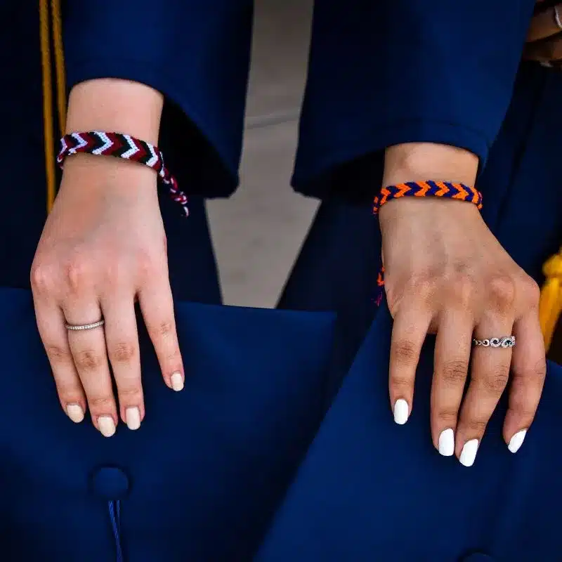
Level 2: Complementary Contrasts
Complementary colors sit opposite each other on the color wheel, offering high contrast and visual impact.
- How to Use Complementary Colors:
Pairing complementary colors adds excitement and balance to your bracelet. These combinations are bold yet harmonious, making them perfect for statement pieces. - Popular Complementary Pairings:
- Red and green for a festive holiday vibe.
- Blue and orange for a vibrant, energetic look.
Part 3: Nature-Inspired Color Combinations – Drawing Inspiration from the World Around Us
Level 1: Earthy Neutrals
Earthy tones mimic the natural world, providing warmth and grounding to your bracelet designs.
- Why Neutral Colors Work:
Neutral palettes like browns, beiges, and grays blend seamlessly with any outfit, making them versatile choices. They also pair beautifully with metallic accents like gold or silver. - Nature-Inspired Neutral Combos:
- Beige, taupe, and ivory with hints of copper for an understated boho aesthetic.
- Charcoal gray, olive green, and mustard yellow for a rugged outdoor vibe.
Level 2: Floral and Botanical Hues
Floral-inspired color combinations bring freshness and vitality to your bracelets, capturing the essence of blooming gardens.
- How to Incorporate Florals:
Use soft pastels or vivid jewel tones to replicate the colors of flowers. Layering different shades creates a dynamic and playful effect. - Floral Color Palettes:
- Lavender, mint green, and peach for a springtime bouquet feel.
- Deep magenta, emerald green, and golden yellow for a tropical floral theme.
Part 4: Bold and Trendy Color Combinations – Making a Statement
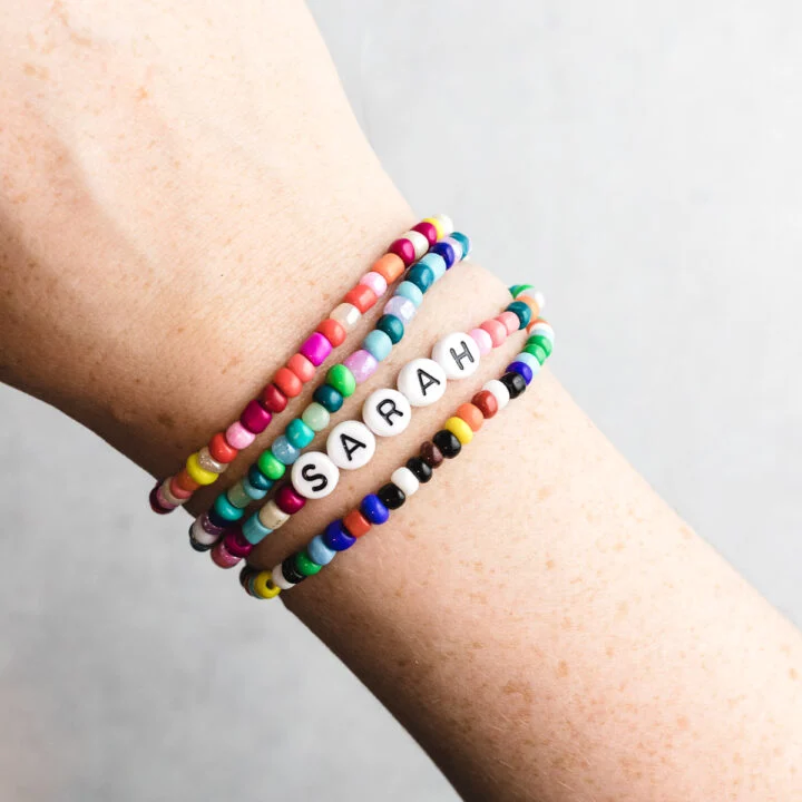
Level 1: Vibrant Rainbow Palettes
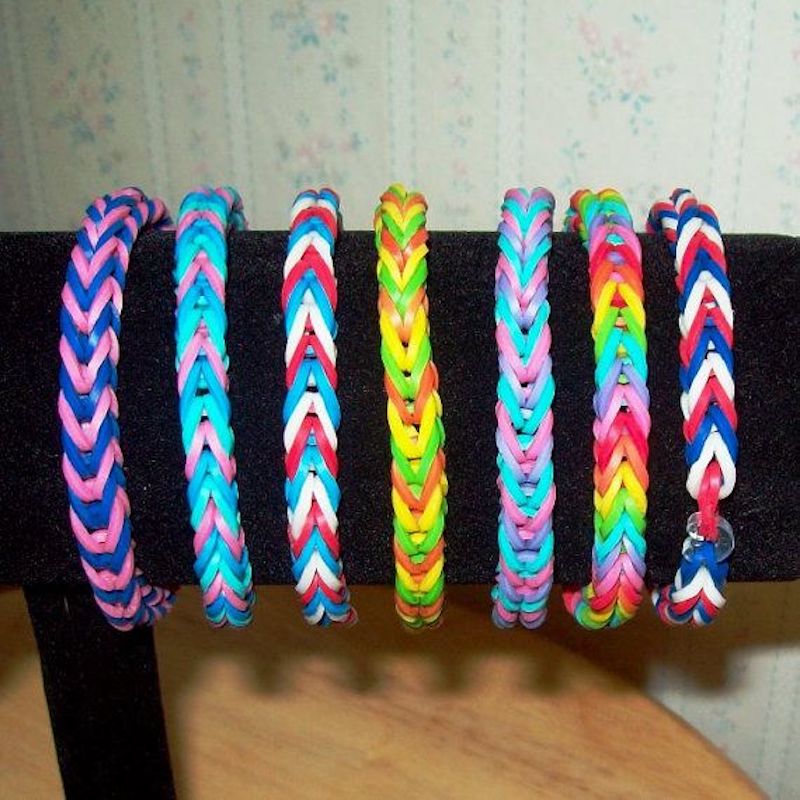
Rainbow-themed bracelets celebrate diversity and joy through a spectrum of bright colors.
- Why Go Bold?
Rainbow combinations are fun, cheerful, and eye-catching, appealing to those who love to stand out. They’re particularly popular for festivals, parties, or casual wear. - Tips for Balancing Bright Colors:
To prevent overwhelming the design, alternate bright beads with neutral spacers or use a gradient pattern to transition smoothly between hues. - Rainbow Examples:
- ROYGBIV (red, orange, yellow, green, blue, indigo, violet) in equal proportions.
- Pastel rainbow shades for a softer, whimsical look.
Level 2: Metallic Accents and Neon Pops
Metallics and neons inject modern flair into traditional color schemes, adding a touch of glamour or edginess.
- Using Metallics Effectively:
Gold, silver, and rose gold complement almost any good color combos for bracelets, enhancing luxury and shine. Use them sparingly as highlights or focal points. - Neon Highlights:
Neon colors like electric blue, hot pink, or lime green add a futuristic twist. Pair them with muted tones to let the neon pop. - Trendy Combos:
- Matte black with neon green and silver accents for a sleek, urban look.
- Soft lilac with rose gold and tiny bursts of neon orange for a chic, contemporary style.
Part 5: Troubleshooting Common Color Challenges – Solutions for Harmonious Designs
Level 1: Addressing Overwhelming Color Choices
Sometimes too many colors can clash or overwhelm a design. Here’s how to simplify and refine your palette:
- Limiting Your Palette:
Stick to three to five main colors per bracelet to maintain clarity and focus. Too many hues can dilute the overall impact. - Using Neutral Spacers:
Incorporate white, black, or metallic beads between contrasting colors to create breathing room and enhance harmony.
Level 2: Fixing Unbalanced Proportions
If certain colors dominate or fade into the background, adjust their placement or quantity to restore balance.
- Reassessing Ratios:
Ensure no single color overwhelms the others by distributing beads evenly or using larger focal beads sparingly. - Adding Contrast:
Introduce darker or lighter shades within the same color family to create depth and prevent monotony.
Inspiration Gallery – Stunning Color Combinations to Try
Level 1: Everyday Classics
These versatile combinations work for daily wear and complement a wide range of outfits.
- Nautical Charm:
White, navy blue, and gold for a timeless maritime-inspired look. - Autumn Warmth:
Burnt orange, mustard yellow, and burgundy for a cozy seasonal vibe.
Level 2: Seasonal Statements
Celebrate the changing seasons with these themed color palettes.
- Winter Wonderland:
Icy blue, silver, and white for a frosty, elegant design. - Summer Sunshine:
Bright coral, turquoise, and lemon yellow for a cheerful, beachy aesthetic.
By mastering the art of color combinations, you can elevate your bracelet designs from simple accessories to works of art. Whether you’re crafting for yourself, gifting to loved ones, or selling your creations, thoughtful good color combos for bracelets choices will ensure your bracelets leave a lasting impression—one bead at a time!
Conclusion: Finding Your Signature Style – Crafting Bracelets That Speak to You
Level 1: Reflecting Personality Through Color
Your choice of color combinations reflects not only your personal taste but also the emotions and stories you want to convey through your jewelry.
- Expressing Individuality:
Whether you prefer calming neutrals, vibrant rainbows, or elegant monochromes, your bracelets become an extension of your personality. Experimentation is key to discovering what resonates with you. - Creating Meaningful Pieces:
Consider incorporating colors that hold special significance, such as birthstone hues or favorite shades, to make your bracelets even more personal.
Level 2: Adapting to Trends While Staying True to Yourself
While staying informed about current trends is helpful, don’t lose sight of what makes your designs unique.
- Balancing Trends and Authenticity:
Incorporate trendy elements like neon or metallics if they align with your vision, but always prioritize what feels authentic to you. A well-crafted bracelet tells a story that transcends fleeting fads. - Continuous Learning:
Keep exploring new good color combos for bracelets, experimenting with unexpected pairings, and seeking inspiration from art, fashion, and nature to continually evolve your craft journey.